02 / Design systems · Simply Stakeholders
Simply Stakeholders Design System
A Figma system connecting visual foundations, reusable objects, documented component states, and page patterns for a complex stakeholder-management product.
60-second summary
A broad interface library needed consistent patterns and a clearer way to find decisions across data-heavy workflows.
Organize the library in layers, then document variants, interaction states, and the page patterns built from them.
Library architecture, visual foundations, reusable object and component specifications, and page-level patterns.
A navigable reference connecting foundational rules and reusable UI to their application across the product.
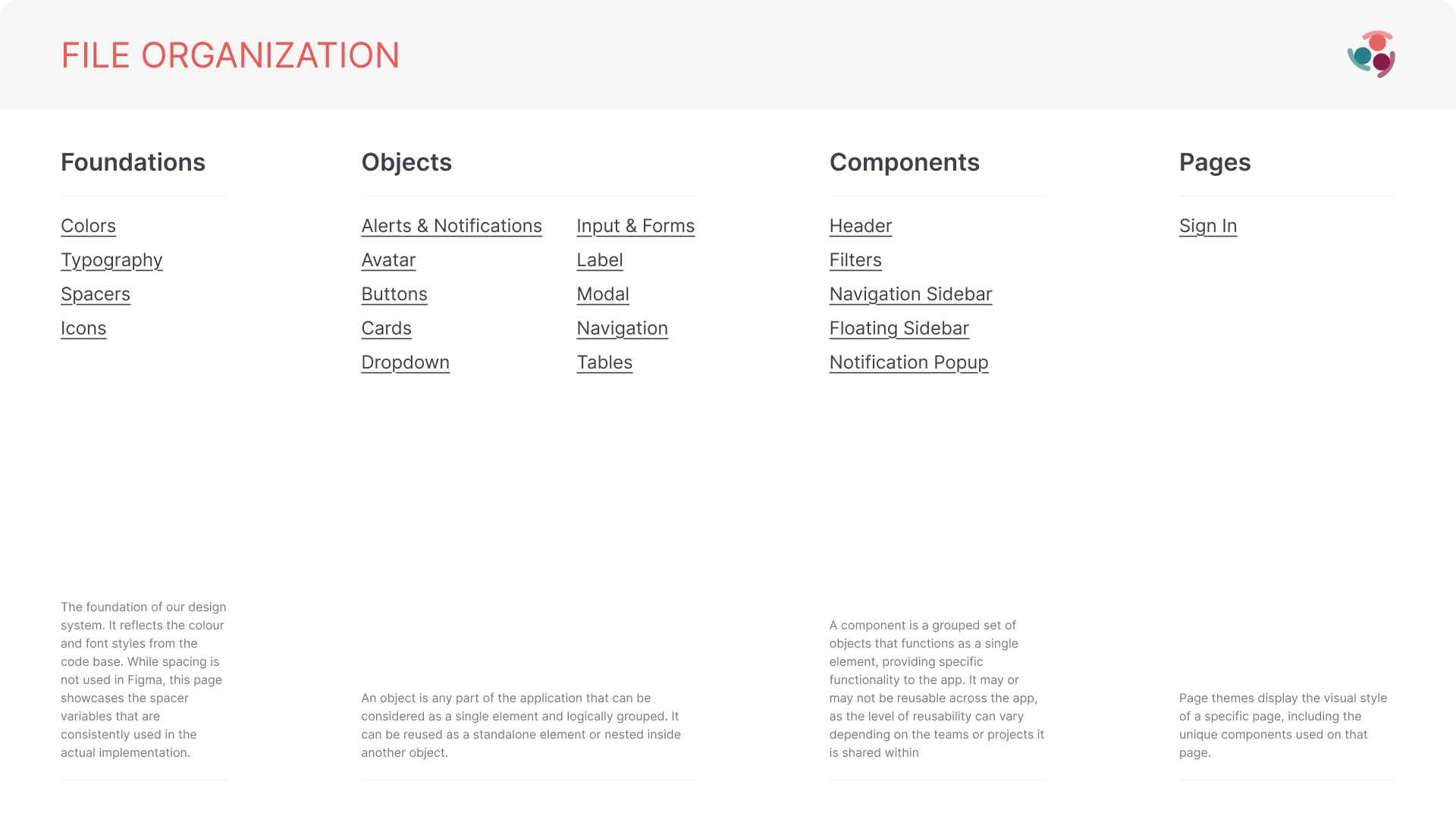
The entry point defines four layers—Foundations, Objects, Components, and Pages—and gives each kind of design decision a clear home.
01 / Information architecture
Build the map before the catalogue.
The library opens with a model for where decisions live, not a wall of disconnected components.
Foundations hold shared visual rules. Objects capture reusable interface elements. Components combine those objects into larger units, while Pages preserve product-specific references. That separation makes the level of reuse visible before someone enters an individual section.
- Foundations for color, type, spacing, and icons
- Objects for reusable interface elements and their variants
- Components for composed product structures
- Pages for contextual, product-specific application
02 / Foundation system
Make visual decisions reusable and inspectable.
Color ramps, type styles, spacing values, and iconography establish the constraints beneath the interface.
The foundation reference names recurring decisions instead of leaving them embedded inside individual screens. Typography documents scale, weight, and line height; color separates brand, status, data-visualization, AI, and interface roles; spacing and icon libraries provide consistent building blocks for layout and action.
- Named color roles and tonal ramps
- Type styles across display, title, body, and labels
- A shared spacing scale from fine detail to page layout
- General and feature-specific icon references
03 / Components and states
Specify behavior, not only the default state.
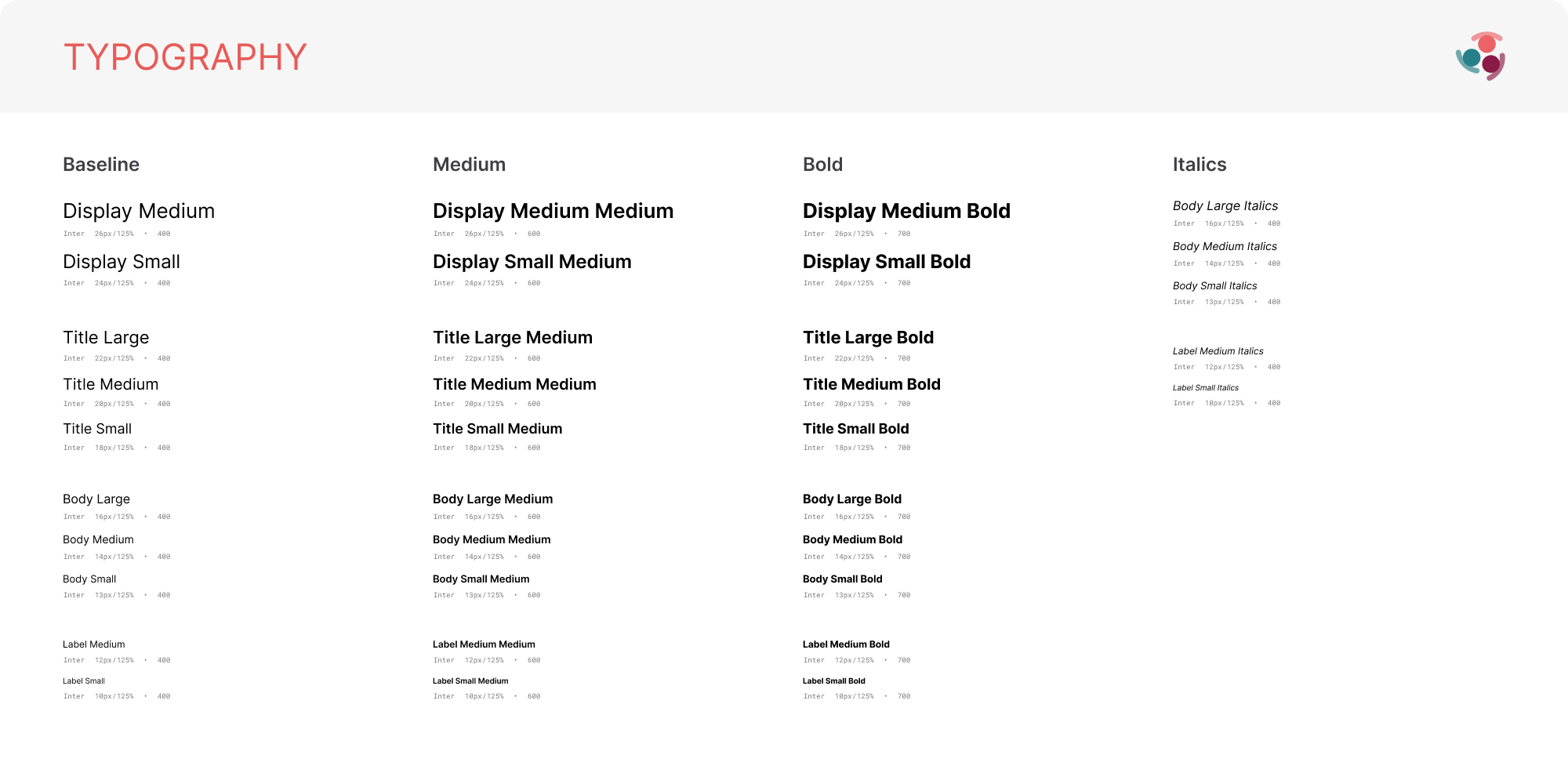
The component catalogue makes interaction and system feedback visible across sizes, variants, and states.
Inputs show normal, hover, focus, populated, error, and disabled behavior. Buttons, labels, avatars, dropdowns, alerts, modals, navigation, cards, and tables extend that same discipline across the interface, making edge cases part of the component definition rather than an implementation afterthought.
- Default, hover, focus, error, and disabled states
- Size and style variants for repeated controls
- Status patterns for alerts and notifications
- Composed patterns for cards, modals, tables, and navigation
04 / Product application
Carry the system into data-heavy workflows.
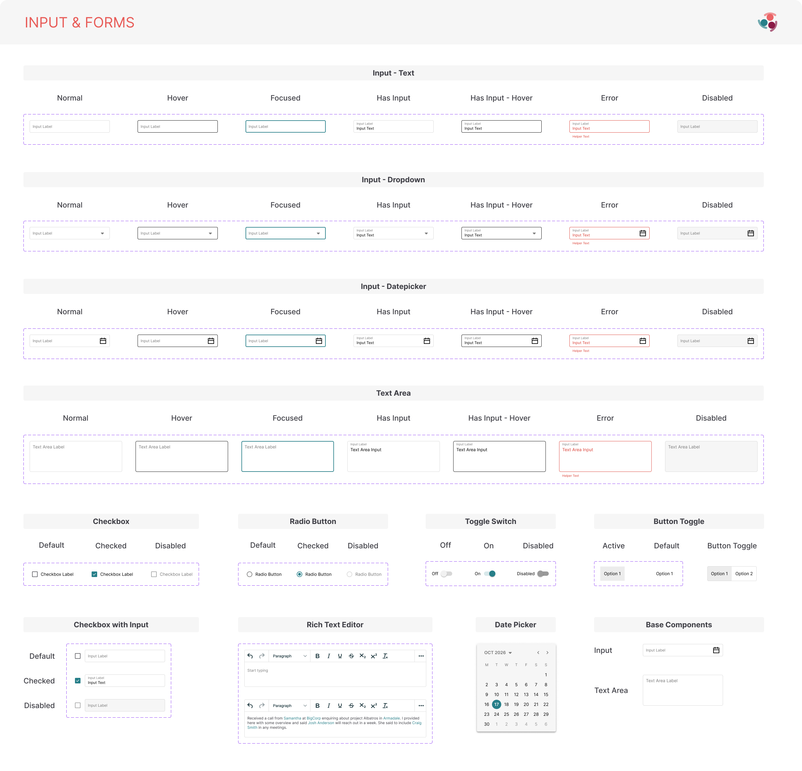
Page references show how the building blocks work together inside navigation, filtering, notification, and record-management surfaces.
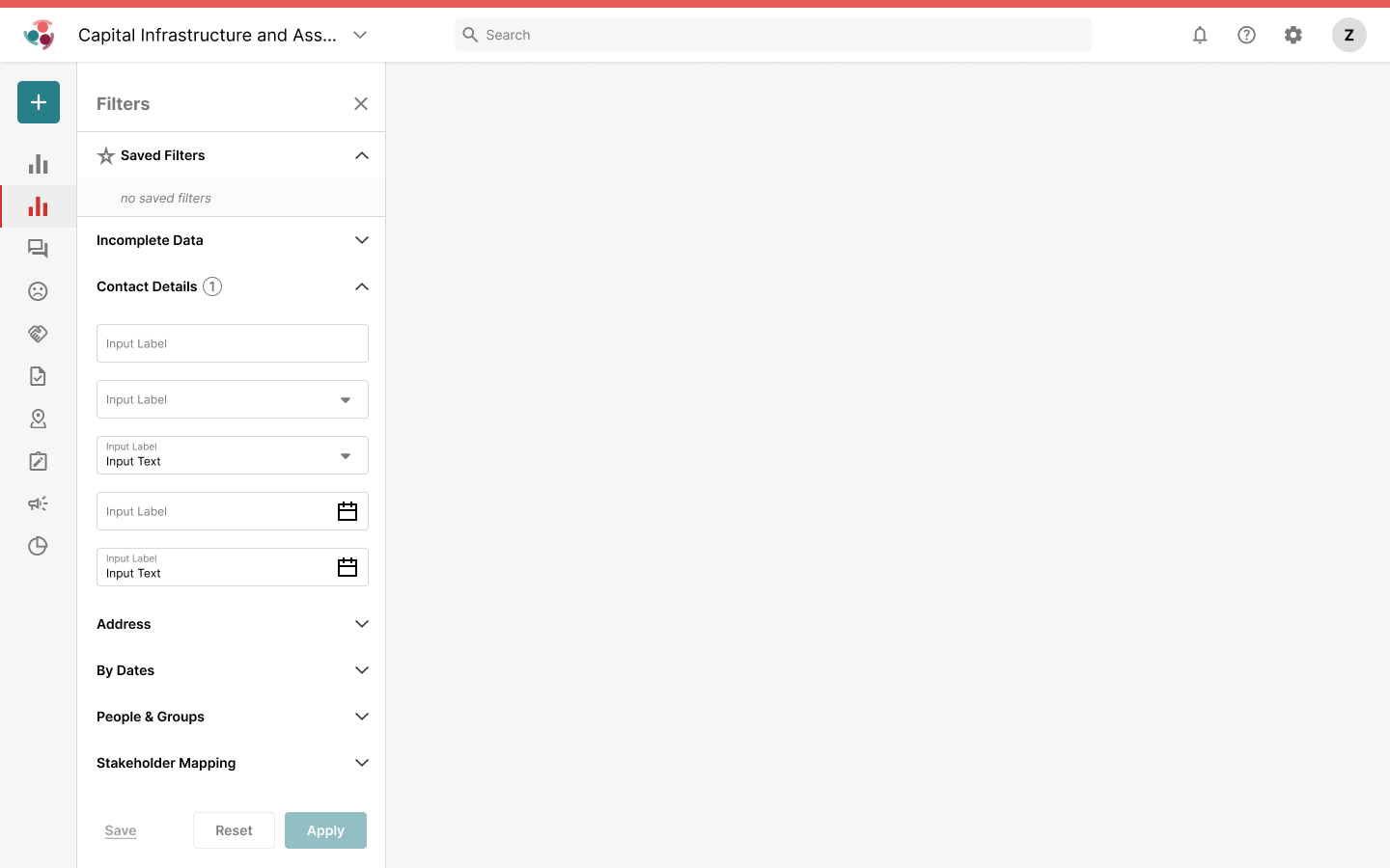
The product examples connect library decisions to dense application layouts: persistent navigation, project switching, expandable filter groups, notification states, page tabs, action bars, and reusable table structures. These references make composition and hierarchy inspectable at product scale.
- Consistent shell and navigation behavior
- Filter panels built from shared controls and disclosure patterns
- Notification states carried into a product popover
- Tabs, actions, tables, and page hierarchy working as one system
05 / Foundation evidence
Rules beneath the interface.
These references make the visual language inspectable: semantic color roles, a deliberate spacing scale, and a shared icon vocabulary that can support both product UI and specialized features.
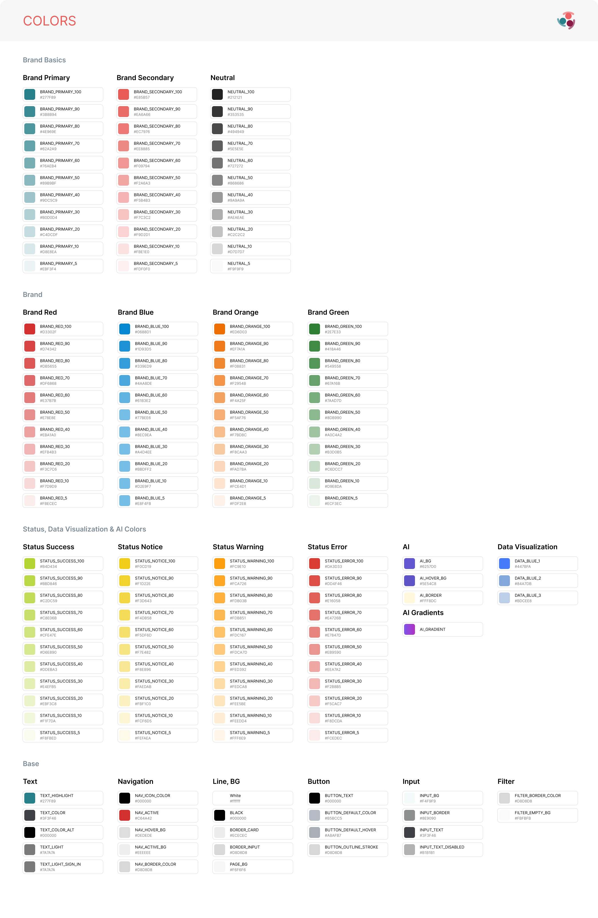
Named ramps separate brand colors from semantic status, data-visualization, AI, and base interface roles.
Open original ↗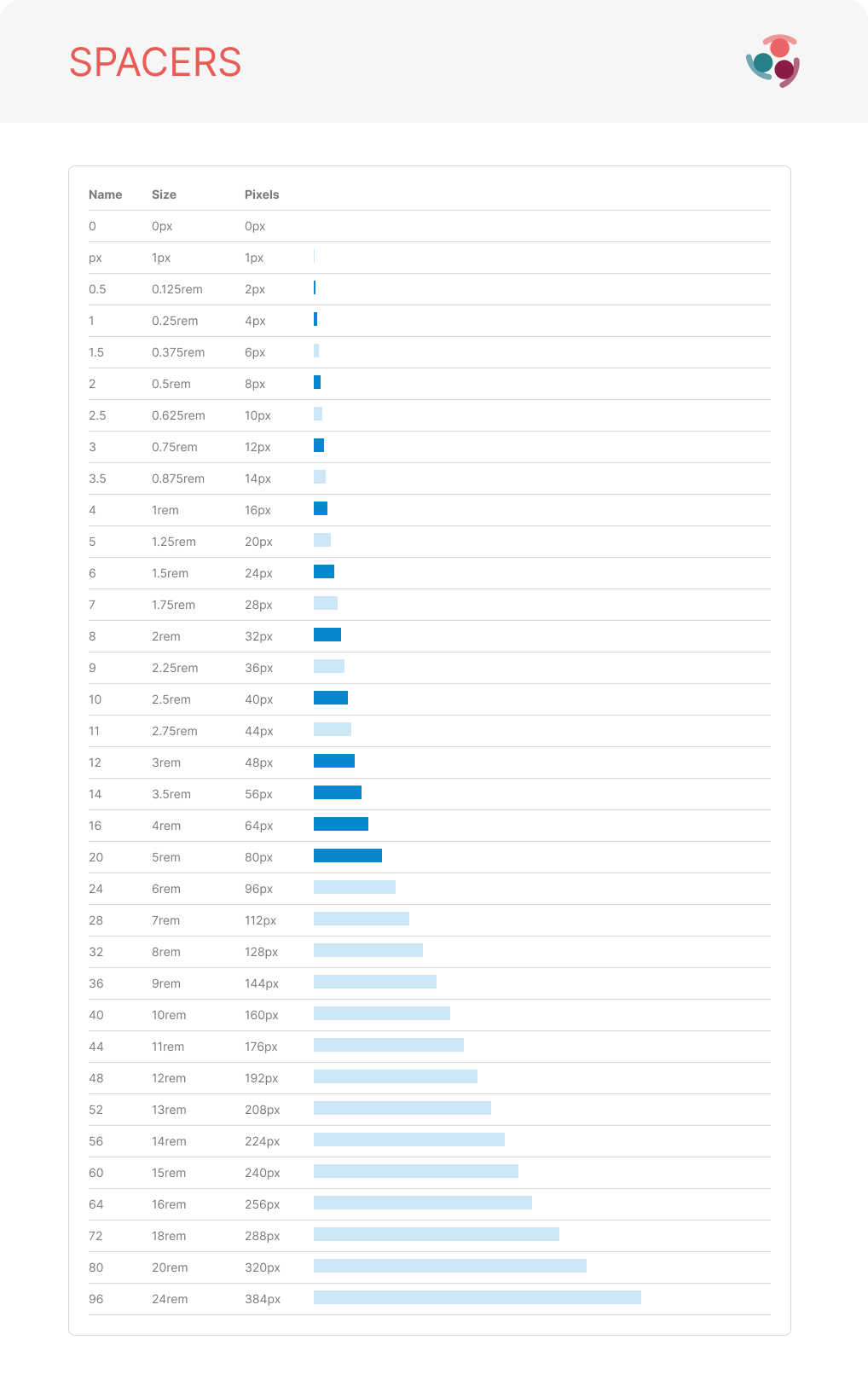
A documented scale connects fine-grained spacing to larger layout intervals through named rem and pixel values.
Open original ↗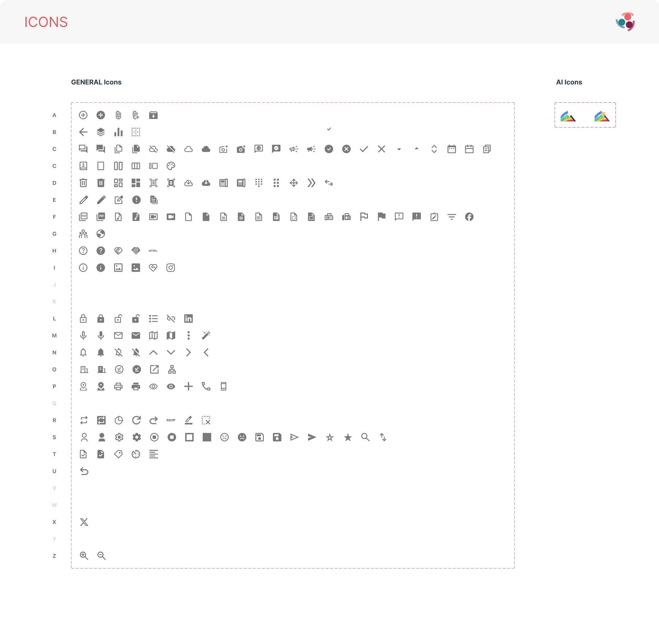
A shared catalogue covers common product actions alongside a smaller set of feature-specific AI icons.
Open original ↗06 / Object and component evidence
Reusable behavior, documented in context.
The catalogue covers primitive controls and composed structures. Variants, sizes, feedback, and edge states are presented together so each pattern can be evaluated as a system rather than an isolated mockup.
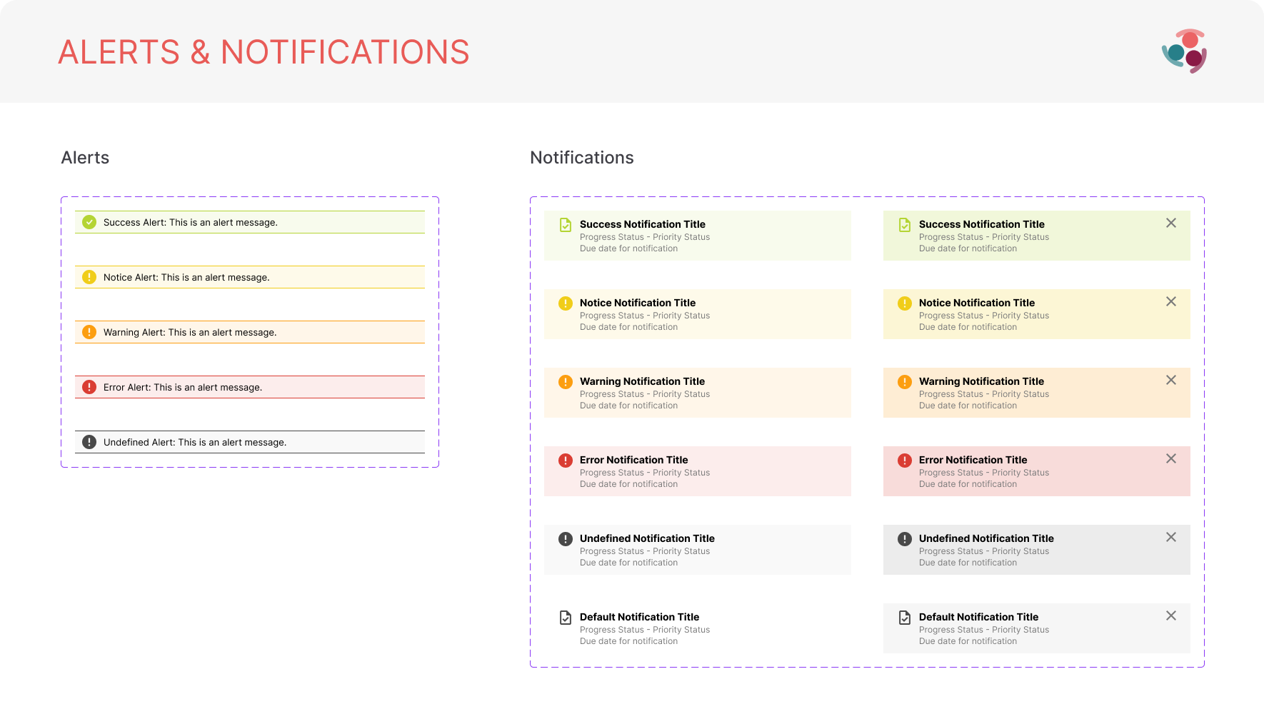
Semantic feedback patterns share a consistent hierarchy while distinguishing status through color and iconography.
Open original ↗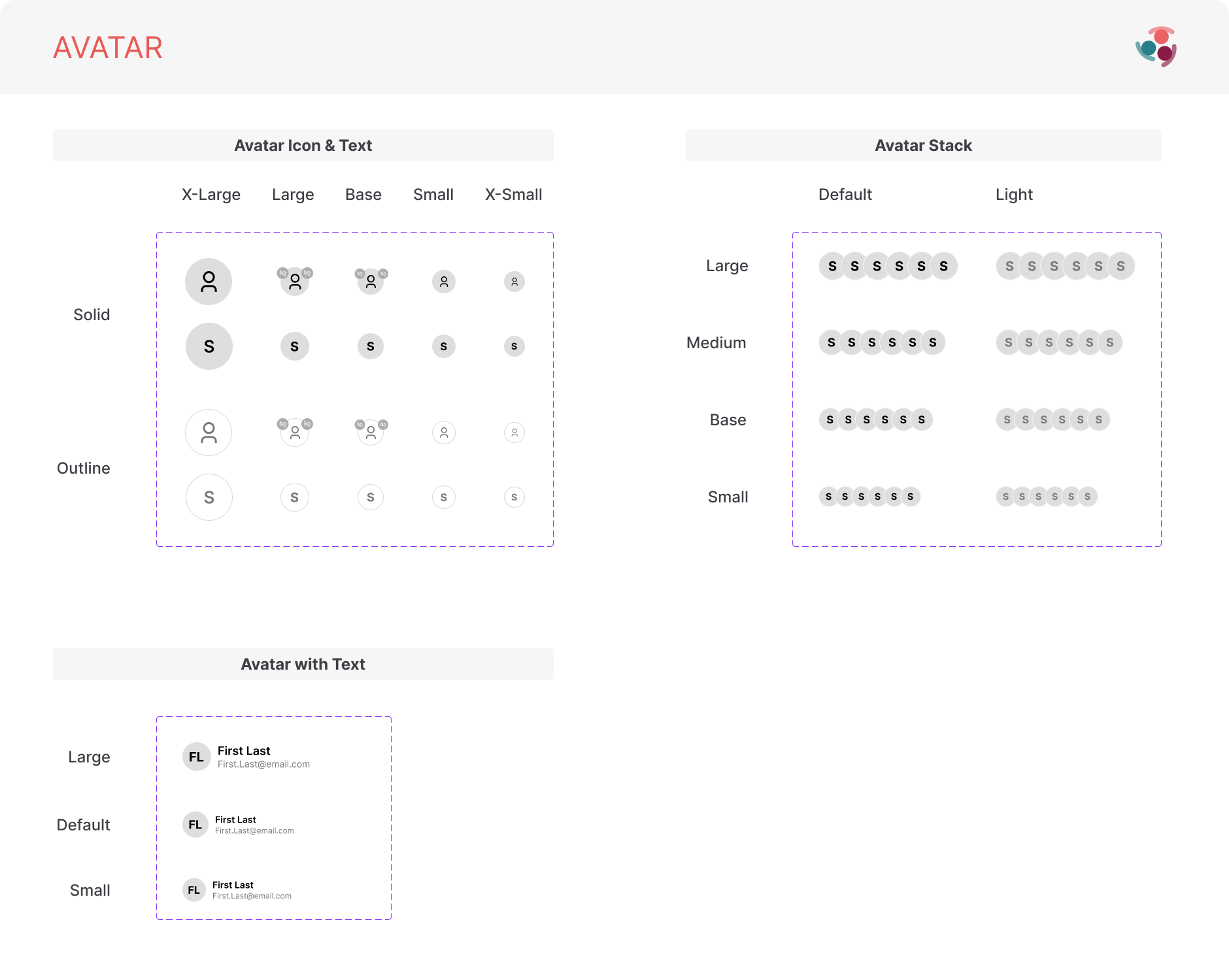
Solid and outline avatars scale from individual identity to stacks and identity-with-text patterns.
Open original ↗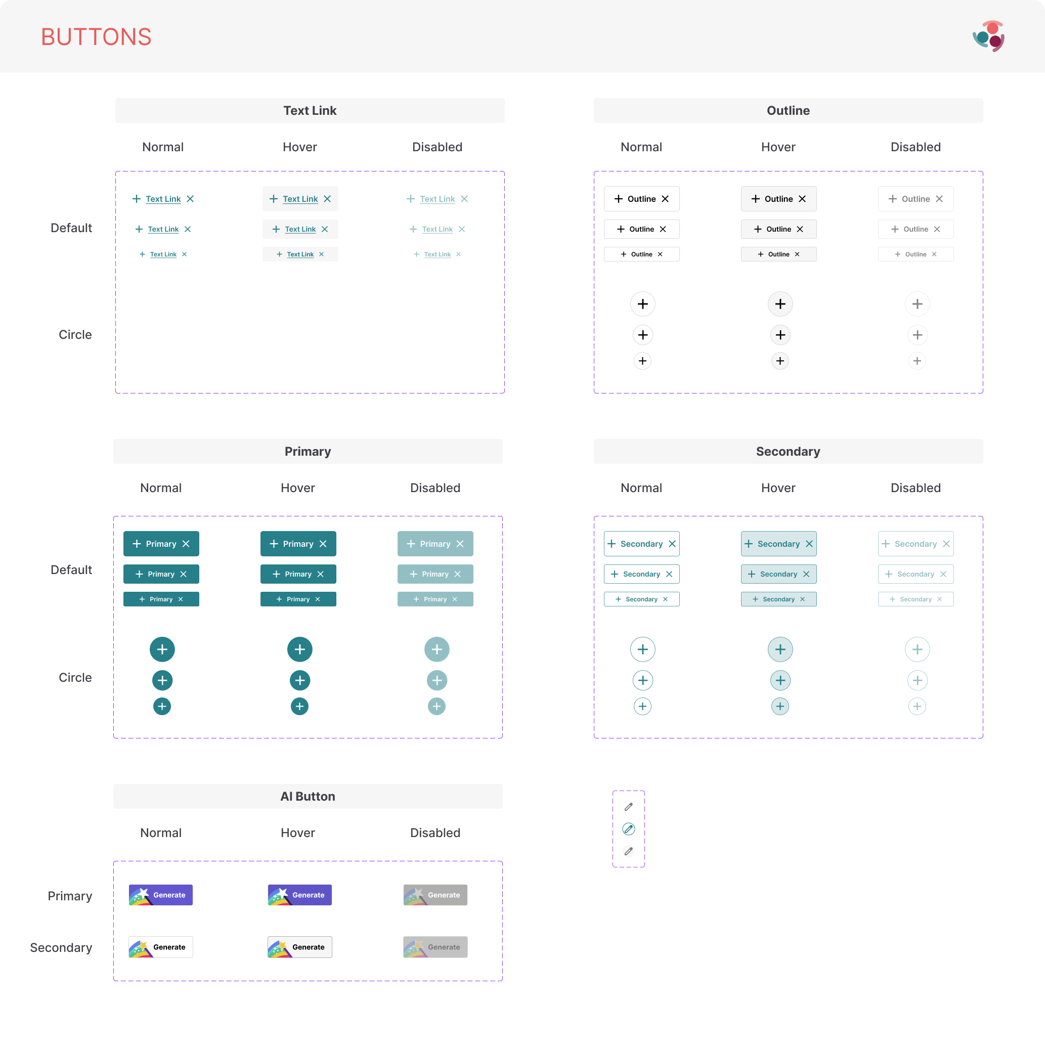
Action hierarchy is documented across normal, hover, disabled, size, shape, and AI-specific variants.
Open original ↗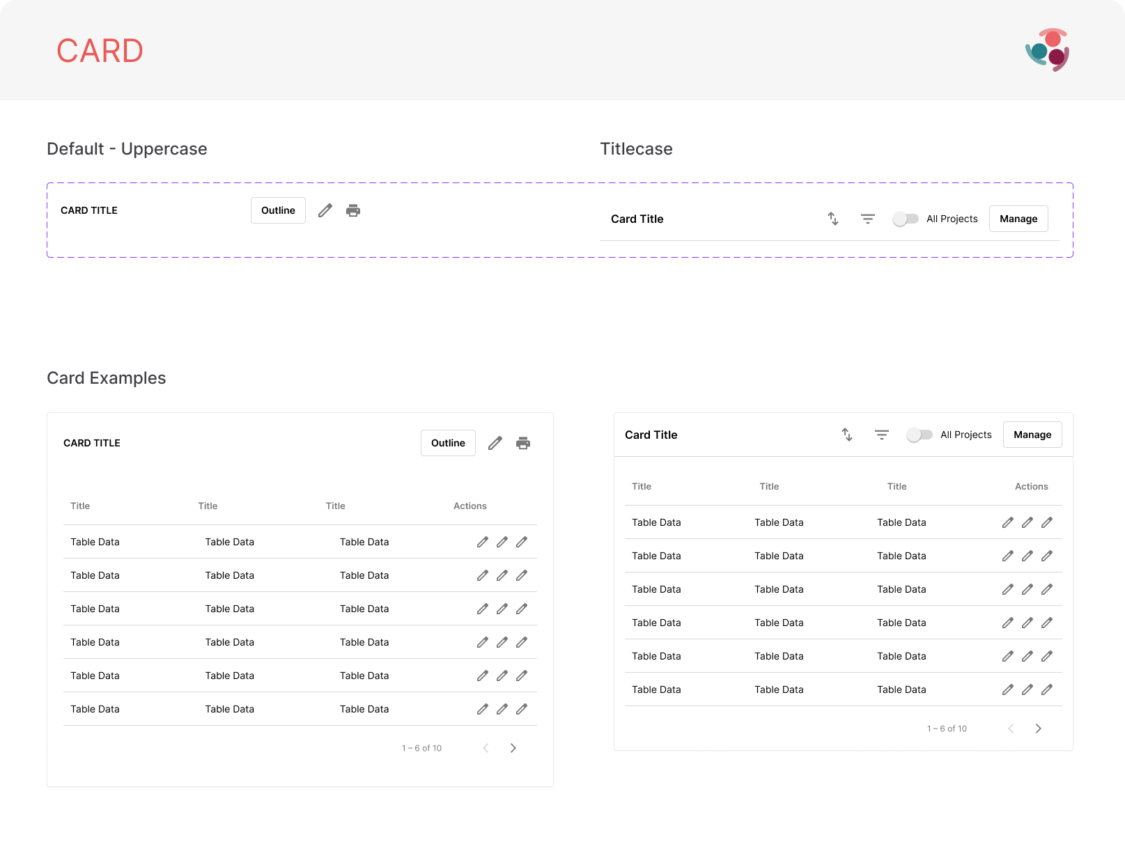
Card specifications connect title treatment and action areas to data tables and pagination patterns.
Open original ↗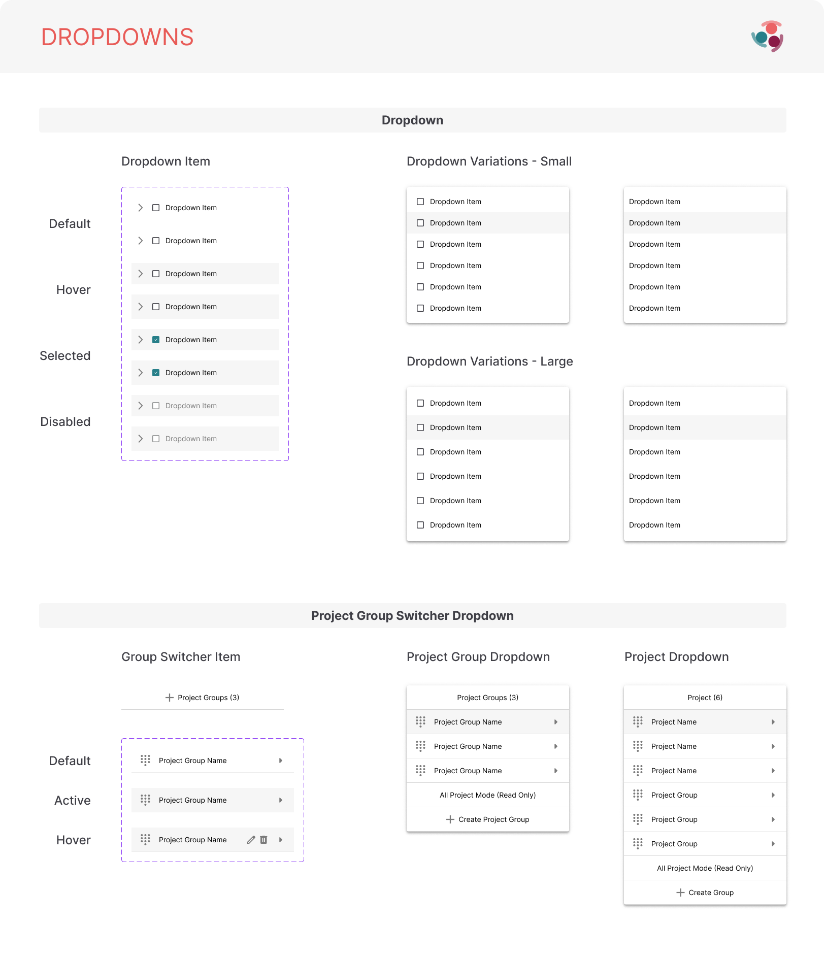
Item states and menu sizes extend into multi-level project and project-group switching patterns.
Open original ↗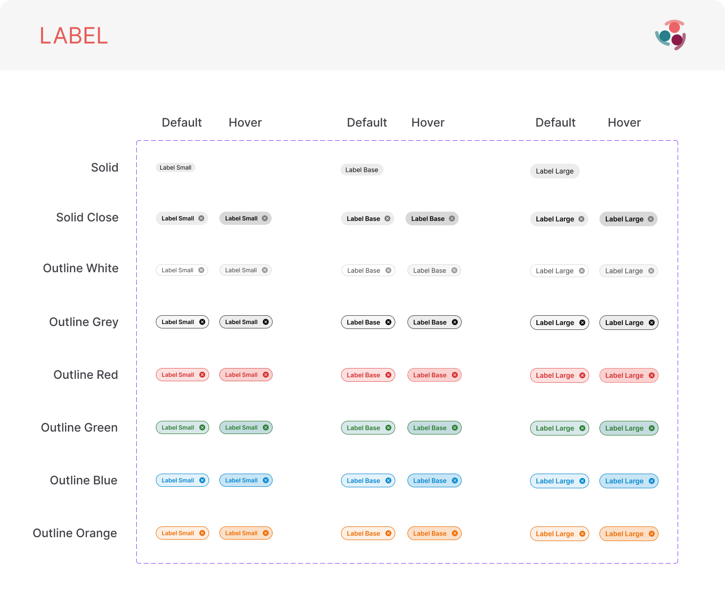
Labels combine size, dismissible behavior, outline treatment, and semantic color without changing their core structure.
Open original ↗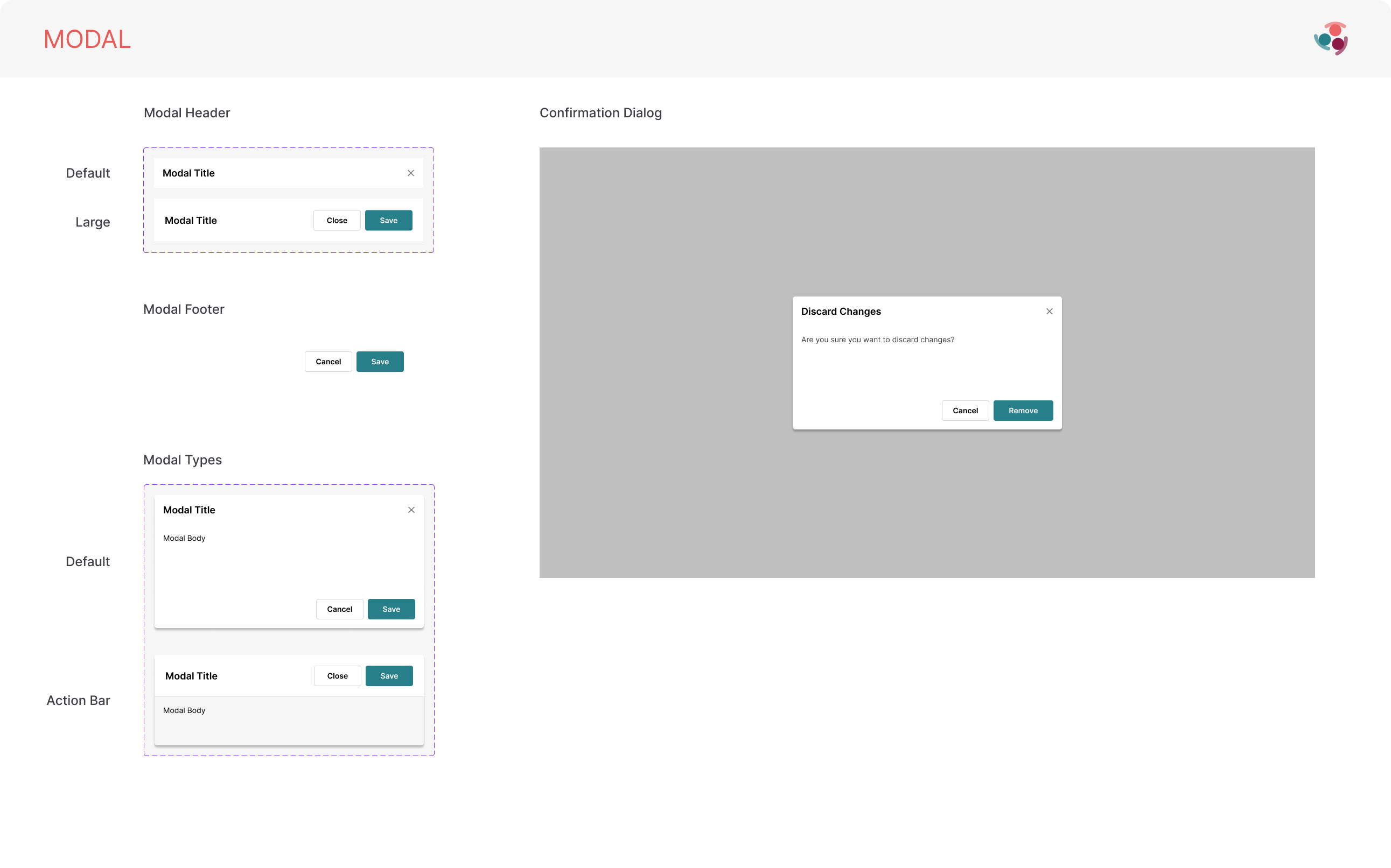
Headers, footers, action bars, and confirmation treatments define consistent modal composition and decision hierarchy.
Open original ↗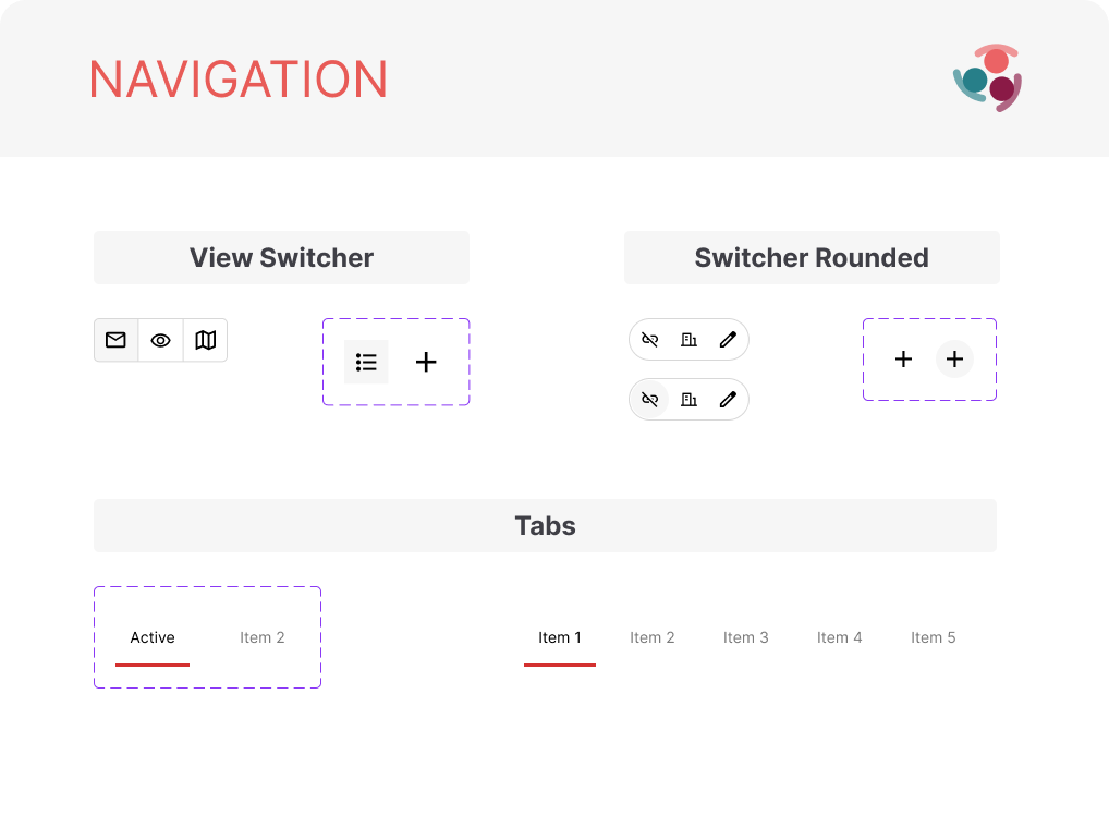
View switchers and tabs document selection, grouping, and active-state treatment across navigation types.
Open original ↗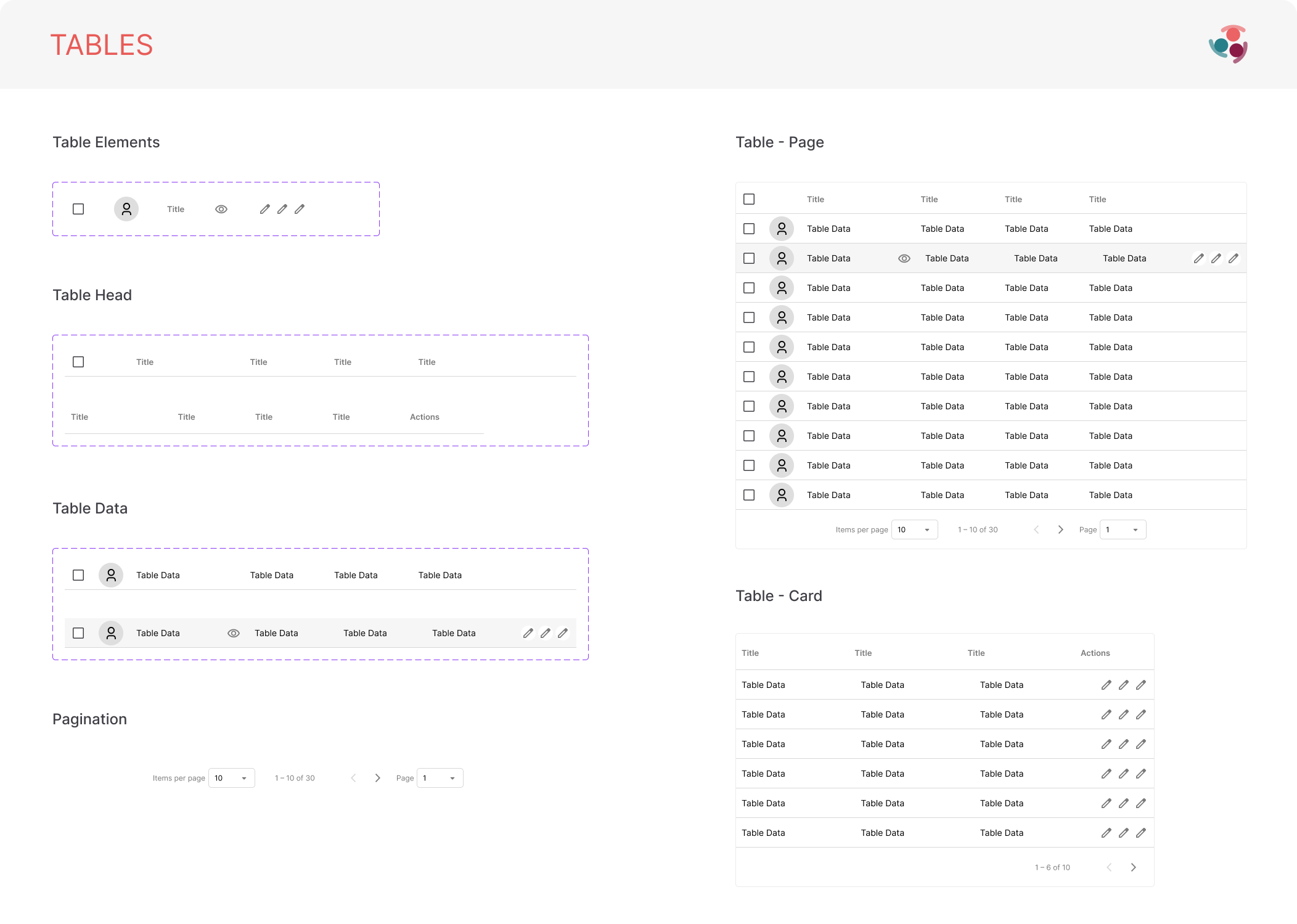
Row anatomy, selection, identity, actions, pagination, and page or card contexts are treated as one reusable data pattern.
Open original ↗07 / Product application evidence
The system assembled into workflows.
Page references demonstrate how the library behaves beyond the component canvas. The same navigation, disclosure, feedback, and action patterns are composed into real product structures.
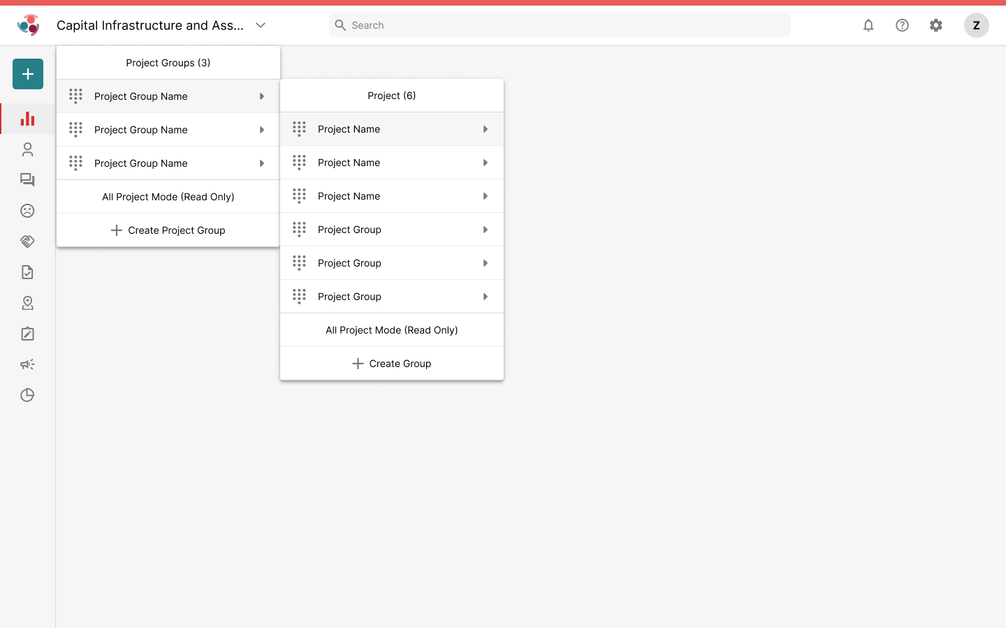
Nested menus apply shared dropdown behavior to movement between project groups and individual projects.
Open original ↗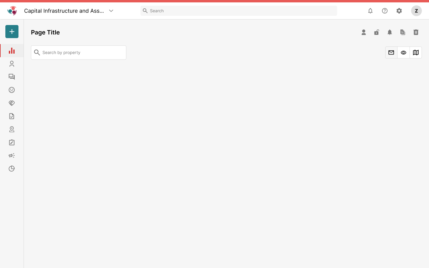
Global navigation, search, page actions, and view controls establish a consistent starting structure for product pages.
Open original ↗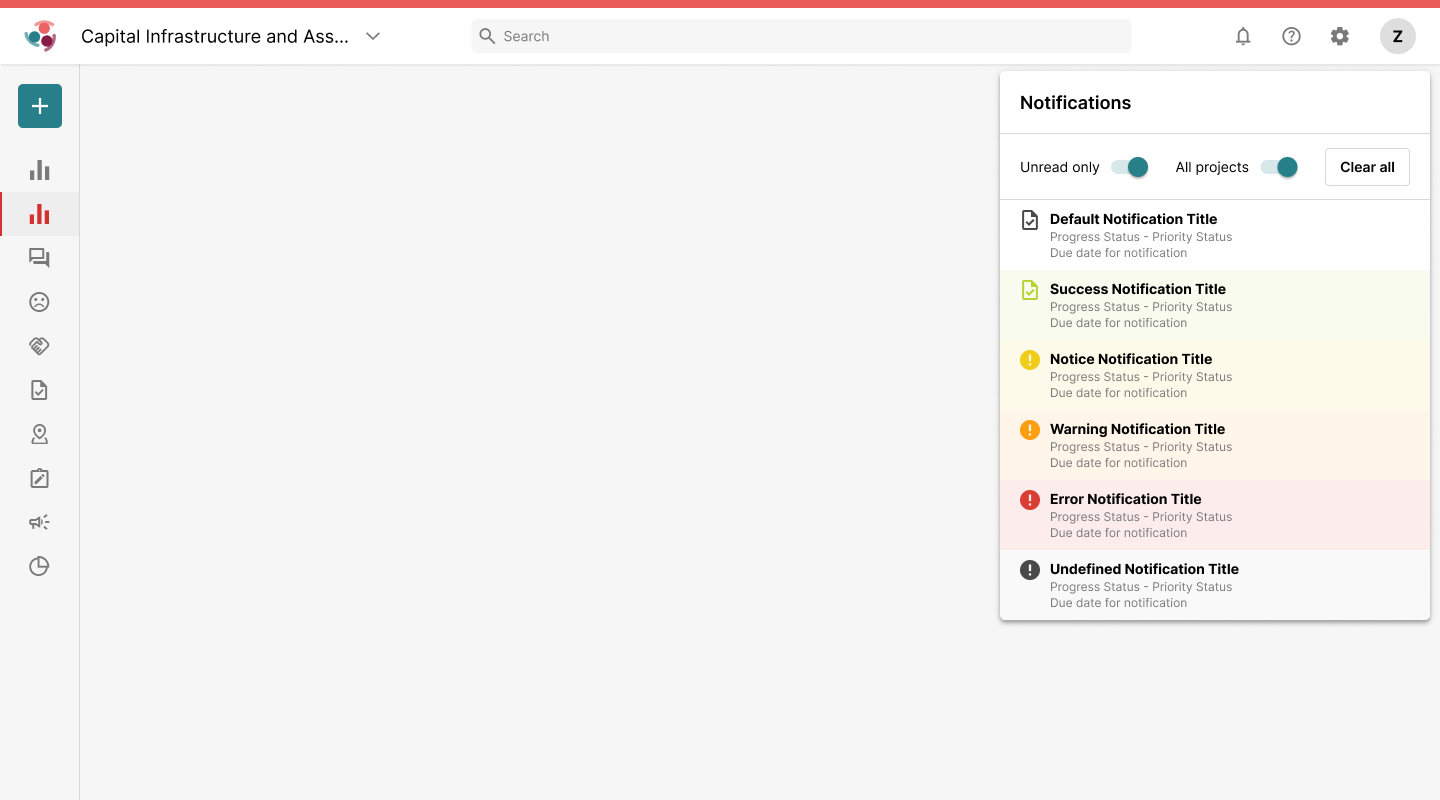
Library-level feedback states are composed into a product popover with filtering and clear-all actions.
Open original ↗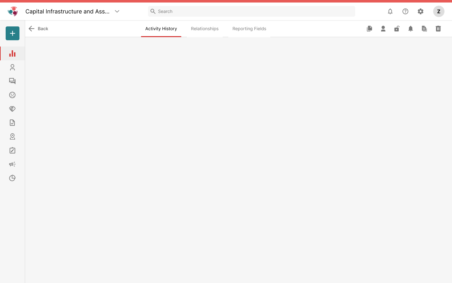
Tabs and record actions share a stable page bar, keeping hierarchy visible across detail views.
Open original ↗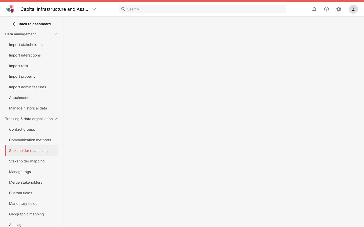
Grouped, nested navigation applies consistent active and disclosure states to a dense administration structure.
Open original ↗Outcome and reflection
A system connecting primitives, behavior, and page structure.
Across the supplied artifacts, the library moves from named visual foundations to reusable object and component specifications, then into navigation, filtering, notification, table, and record-management surfaces. That continuity gives product decisions a traceable path from rule to application.
The useful part of a design system is the connective tissue between levels. Clear library architecture helps people find a decision; documented states make the component dependable; page references show how those parts should behave together inside the product.