02 / Product snapshot · Later
Instagram Analytics
Turned dense Instagram performance data into a visual, comparable workspace spanning audience, posts, Reels, Stories, hashtags, and shareable reports.
60-second summary
Marketers needed to understand what was working without piecing together disconnected metrics, content types, and reporting views.
Product Design · UI Implementation · Web app
Organize the product from macro to micro, then keep directly comparable data together through reusable navigation, graph, table, and state patterns.
A structured analytics workspace documented in a customer-facing Later walkthrough, with patterns for audience, content, hashtag, and report analysis.
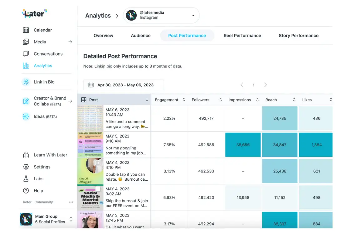
Detailed post performance keeps content and comparable metrics in one sortable working surface.
Decisions and system thinking
Making dense performance data easier to scan, compare, and explain
The work treats information architecture, visualization, and interface states as one system rather than separate screens.
Move from the big picture into the detail.
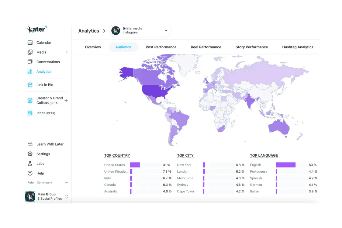
Tabs progress from overview and audience context into post, Reel, Story, and hashtag performance. Related metrics stay together so comparisons do not require unnecessary navigation.
Choose the view that matches the analytical question.
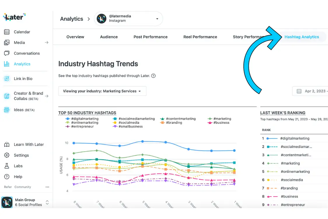
Time-series graphs expose change and ranking over time, while sortable tables support high-volume content comparison. Clear legends, headings, and scales make each form legible.
Explain technical data in plain language.
Microcopy, empty states, and error states translate analytics terminology into useful next steps, keeping the system approachable when data is incomplete or unavailable.
Shipped information model
One path from overview to shareable evidence
- 01Understand account performance at a glance
- 02Inspect audience composition and activity
- 03Compare posts, Reels, and Stories
- 04Track industry and owned hashtag trends
- 05Share a performance report
Shipped-product walkthrough
Instagram Analytics product walkthrough
This later production walkthrough demonstrates the breadth of the shipped workspace. It is presented as public product evidence, not as a launch-era impact metric.
Evidence boundary
What this public material can—and cannot—show
The interfaces and walkthrough demonstrate a shipped analytics system. They do not establish adoption, business impact, team size, or a precise boundary between hands-on code and implementation-quality responsibility, so those claims remain intentionally conservative.
Design contribution
What I contributed across the product workflow
- Project-scope definition with product
- Competitor and user research and testing
- Impact–effort prioritization
- User flows, prototypes, and interaction definition
- High-fidelity product design
- Figma component-library creation
- HTML/CSS implementation quality
A Later Influence workflow connecting inline replies, flexible organization, and clearer message triage.